Special Interest
General Sources
On William Smith (here)
The Wilson Cycle (here)
MegaConverter (here)
LMNO Engineering Website: (here)
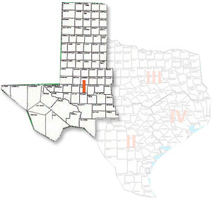
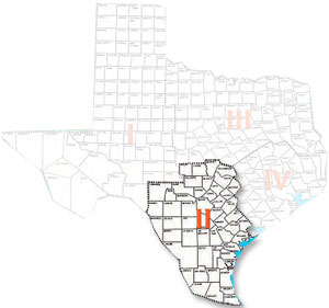
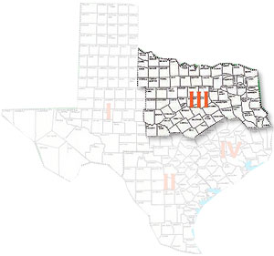
Houston Area Growth Faulting & Subsidence: (see Figure >>>)
Technical Information Transfer Tips “How to Sabotage a Presentation”
By Hugh Hay Roe, Published in the April, 1999 issue of the HGS Bulletin and HGS Online
Not long ago I attended an oil-patch conference where most of the speakers used either 35 mm slides or page-size transparencies for an overhead projector. Only a few of the speakers took advantage of new digital imaging technology to help put their message across. Many more handicapped themselves with poor delivery and mediocre visual aids, despite the fact that most professional societies have been hammering their members for years about weak oral presentations with inferior visuals. Just for the heck of it, I took notes on the most effective techniques for torpedoing a presentation; there were more than a dozen.
The Searchlight Effect
Keeping an audience awake is a great idea, but not by blinding them with transparencies that have a clear background… and perhaps weak, spidery text as well (use boldface wherever feasible). Colored transparencies (yellow, blue, green, red) are so widely available, there’s no excuse for giving an audience the equivalent of snow blindness.
Mafia Firepower
One speaker, obviously proud of her ammunition, showed a slide with 12 bullets on it. That’s a bit much, even using the “build” technique (adding successive bullets, one at a time), which is so easy with digital imaging and a good graphics program. Two slides with six bullets each would be a major improvement, and three slides with four bullets each would be still better.
Avant-garde Art
Software applications like Freelance and PowerPoint allow one to show a vast amount of statistical information graphically, but it’s a mistake to cram it all on the same graph, even in glorious Technicolor. The audience will soon give up trying to untangle the multiplicity of curves.
Backward, March!
One speaker who took advantage of two screens and dual projectors managed to do it backwards, starting with the right-hand screen and then proceeding to the left. But because we read from left to right, audiences are more comfortable when the slide progression goes in the same direction. When you are going to leave a reference slide on one screen for an extended time, it helps if it’s on the left-hand screen; that allows the audience to progress from the known to the unknown (the new slide on the right). For the same reason, the speaker should, if possible, be stationed to the left of the screen(s), or at least in between two screens – not on the far right.
Snow Blindness Revisited
Another presenter dazzled the audience with yellow letters on a white background, and then, for variety, gave us black letters on a dark blue background. Anyone wearing those glasses that darken or lighten automatically must have loved that paper.
Binoculars, Anyone?
Quite a few speakers used a minute font size – completely illegible from the back of the auditorium. On overheads, 30 pt boldface fonts are good (preferably sans serif). The test for readability of 35 mm slides is simple: one should be able to hold the slide up to the light and read the text with the naked eye. Readability is also improved by using upper and lowercase; all caps should be reserved for headings.
Truly Elegant Wallpaper
Today’s computer graphics programs provide all sorts of nifty capabilities, some of which should be resolutely avoided in slide-making. Several speakers evidently felt obliged to liven up their slides with backgrounds that looked like the wallpaper in a Victorian bordello. Dark marble or wood-grain backgrounds are distracting enough with bold white text; with black text, they may become unreadable. One presenter even used a quasi-floral pattern as background for a graph – a great way to camouflage the essentials.
The CPA Syndrome
It’s true that most people take in complex information better by eye than by ear, but that’s no reason to sandbag an audience with a massive spreadsheet containing – apart from the column and row headings – absolutely nothing but large numbers in a small font. Such a table is probably the very worst type of visual aid.
By no means were all the fumbles were limited to the visual aids, of course; presenters dropped the ball in other ways as well.
The Art Connoisseur
Even in a large auditorium, audiences appreciate eye contact with the speaker, particularly if they are sitting near the front. But some speakers kept their backs turned to the audience in order to admire, and speak to, their visual aids.
Toys for Nervous Speakers
Jingling keys or a handful of pocket change is distracting enough, but two nervous presenters I noticed were playing with the laser pointer. Inducing the audience to chase the ruby dot around the walls and ceiling is a great way to keep them from focusing on the message. When a laser pointer is not in use, it should be turned off.
The Solemn Reader
Other speakers, even when they had visuals to cue themselves, read every word from a detailed script, without even glancing at the visuals or the audience. The favored voice for reading technical material seems to be a solemn monotone – ideal for putting people to sleep.
The Speed Demon
What do you do when you have too much material for the allotted time? The answer should be: reduce the length of the presentation, however painful it may be to amputate without anesthesia. A couple of presenters thought they had a better solution, though; they galloped through the text, reading at a furious pace. This led to one problem shared by the solemn reader – a lack of vocal energy and vocal variety. They droned – but fast. Audiences hate that.
The Unsuspecting Mute
Two other speakers wasted time (and the audience’s patience) by failing to check whether the lavaliere microphone was functioning. Each got well started before discovering the problem and having to start over again.
The Mystery-Story-Teller
Compared to readers, listeners are at a big disadvantage: they can’t jump ahead to find the punch-line (the key idea) of a technical presentation. If they haven’t read an abstract prior to the talk, they are totally dependent on the speaker to orient them before the tricky details start to unfold. Listeners who don’t receive that orientation may become confused or bored; either way, they will likely tune the speaker out. It’s surprising how many technical presenters are willing to risk that.
Considering that technical writers often find themselves performing as technical speakers, it seems like a fine idea to get some experience behind the lectern (which countless misinformed souls refer to as a “podium” – something that presenters stand on). Shortly after joining Toastmasters International in 1976, I found myself wondering why I had waited so long to get this useful experience. People who communicate well in writing already have a big advantage when the time comes to prepare a spoken presentation; often all they need is practice.
In The News
Sponsors of the AIPG-TX GEODAYZ Training Program
2022
2018

